plotting
Sometimes you would like to create a plot out of some text file. You can achieve it by making use of matplotlib.
I have to confess that I am not quite accustomed with matplotlib though, I hereby demonstrate a sample.
installation
Installation is quite simple and one line command suffices.
$ sudo apt-get install python-matplotlib
sample
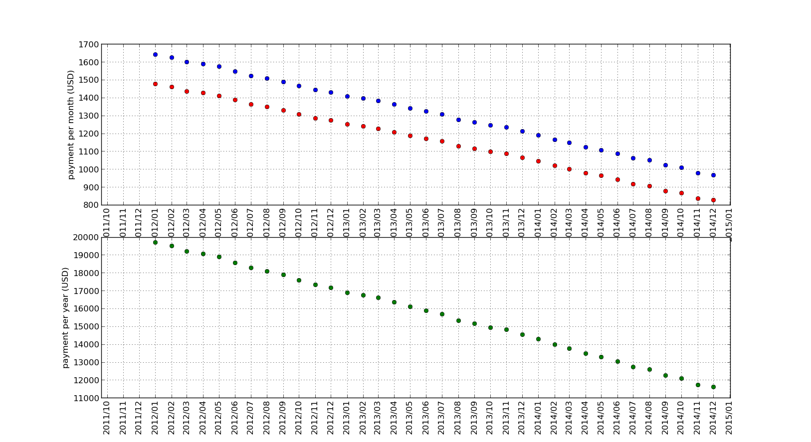
Suppose such a CSV file as follows.
201201,1477,994
201202,1462,988
201203,1437,985
That is, CSV file contains residential loan prepayment history. lines are consisted of,
- month of prepayment
- monthly payment
- bonus payment
plot
You can plot a graph, for example, as follows.
import csv
from datetime import datetime
from matplotlib import pyplot as plt
from matplotlib import dates

if __name__ == "__main__":

    raw_data = "sample.csv"
    fmt = ["prepay", "month", "bonus"]

    # prepayment date
    prepay = []
    # lists to store each values
    monthCal = []
    monthAct = []
    year     = []

    with open(raw_data, "rb") as f:
        reader = csv.reader(f)
        for row in reader:
            prepay.append(dates.date2num(datetime.strptime(row[fmt.index("prepay")], "%Y%m")))
            monthCal.append(int(row[fmt.index("month")]) + int(row[fmt.index("bonus")])/6)
            monthAct.append(int(row[fmt.index("month")]))
            year.append(int(row[fmt.index("month")])*12 + int(row[fmt.index("bonus")])*2)

    # let's start plotting
    fig = plt.figure()

    # monthly graph
    graph = fig.add_subplot(2, 1, 1)
    graph.plot(prepay, monthCal, "bo", prepay, monthAct, "ro")

    graph.xaxis.set_major_locator(dates.MonthLocator())
    graph.xaxis.set_major_formatter(dates.DateFormatter("%Y/%m"))

    plt.xticks(rotation="vertical")
    plt.ylabel("payment per month (USD)")
    plt.grid(True)

    # yearly graph
    graph = fig.add_subplot(2, 1, 2)
    graph.plot(prepay, year, "go")

    graph.xaxis.set_major_locator(dates.MonthLocator())
    graph.xaxis.set_major_formatter(dates.DateFormatter("%Y/%m"))

    plt.ylabel("payment per year (USD)")
    plt.xticks(rotation="vertical")
    plt.grid(True)

    plt.show()
    fig.savefig(raw_data.replace("csv", "png"))